Organizational Typesetting, Color and Readability
Learning Objectives:
- Examine industry standard and in-use social media graphics
- Form hierarchy using type contrast, grouping, fonts, and alignment
- Create and explain conscious and creative choices made
In this first section, I examine advertisements and call-to-action graphics
on social media by looking at their
alignment lines, spacing, and type contrasts.
Organizational Typesetting in the Wild
Panera 100% Free Delivery (6 type contrasts)

Break!
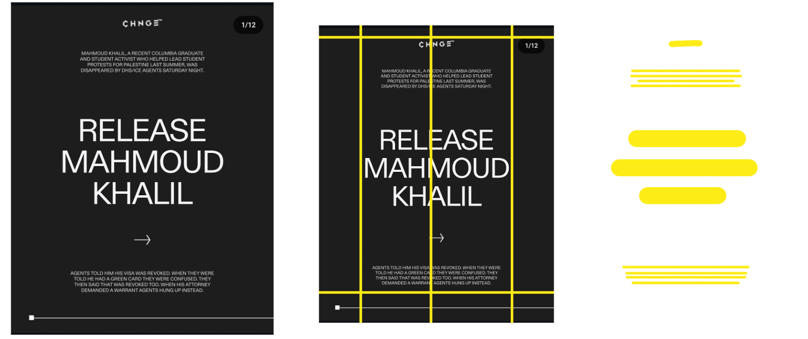
What are all these lines doing on my screen?
Alignment lines! These are lines that designers use to group and separate items from each other, center content around, and create margins.
What is a type contrast?
A type contrast is the differences between one set of type and another which can be done by bolding, italicizing, underlining, enlarging, shrinking, and/or coloring part of the copy.
What are these blobs?
Those are space blocks and designers use them to see what their piece looks like without the copy.
Okay, back to work.
Choices made:
- Emphasized headline
- Panera’s signature green lends to who the brand is
- Repetition of style in tagline
- Smaller font size indicates the viewer should read this second
- Not as important but is the resolution to the copy
- De-emphasized the $25 stipulation
- Tucked away the Panera brand by using a My Panera sticker
- Encourages viewers to click the ad to see the brand
- Also entices non-Panera lovers by offering them free delivery first, Panera second
CHNGE Graphic:
Choices made:
- Extra large call-to-action
- Viewer immediately understands what is being asked of them
- De-emphasized the background information heavily
- Assumes the viewer knows who Mahmoud Khalil is, but offers information to those who don’t
- White-on-black
- Gives off a somber and demanding energy
- All caps
- Makes the call-to-action more demanding
Organizational Typesetting at Work
After reviewing the choices made, I was given copy to create several
different social media graphics, with stipulations, and applied the knowledge to create organized typeset graphics.
Given copy:
“Pangolins are the most trafficked animal in the world. More than 1 million pangolins were trafficked over the last ten-year period. Find out more at www.pangolins.com.”
After receiving the copy, I broke up the copy into the following sections:
background - big number - fact - call-to-action
After breaking up the copy, I ordered and grouped the copy into layers of importance:
- Big number
- Fact and background
- Call-to-action
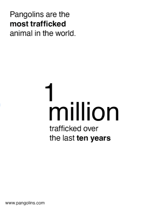
Design 1 Rules
- Only use space and type contrasts to create hierarchy
- Black and gray text only on a white background
- No images
- All text must be left-aligned
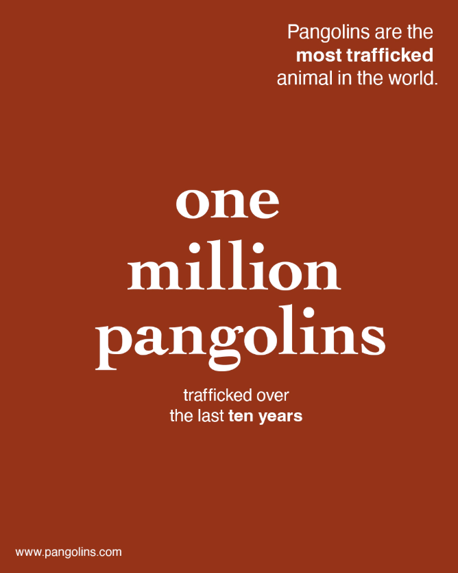
Design 2 Rules
- At least three different type encodings
- Solid colored background
- No images
- Use centered, justified, and/or right alignment
Choices made:
- Emphasize “More than 1 million pangolins were trafficked over the last ten-year period.”
- It’s the most eye-catching piece of information and will lock in the viewer.
- De-emphasize the website link (the call-to-action)
- A viewer will only look for that if they’re interested.
- The call-to-action typically isn’t what grabs the viewer’s eye.
- Highlight “the most trafficked animal”
- Adds suspense when that’s the first piece of information read.
- Adds emphasis when the viewer reads it within its informational context.
- Singular font for the first graphic
- Adds consistency.
- Used bold to switch up the flow slightly.
- Serif font for the second graphic’s factoid
- Adds legitimacy and interest.
After finishing and reflecting, I was tasked with designing social media graphics with the following copy:
“This week’s meal deals: Half price hamburgers $4-7 each Monday, June 21, Taco Tuesday $1 each Tuesday, June 22, Lobster Thermidor $17.99 Wednesday, June 23, Thirsty Thursday Half price drinks Thursday, June 24”
After receiving the copy, I broke up the copy into the following sections:
headline - deals - day of the week - date
After breaking up the copy, I ordered the copy into layers of importance:
- Headline
- Deals
- Day of the week
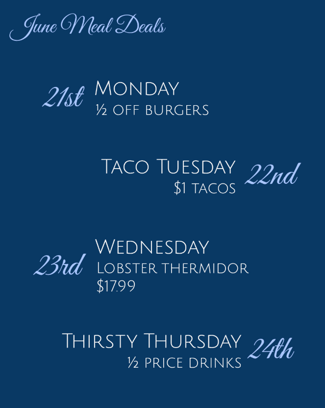
Design 1 Rules:
- No images
- A color background
- Grayscale and color text
- Lay this out as a list
Design 2 Rules:
- Grayscale and color text
- Use a simple grid
- Lay this out as a visual list
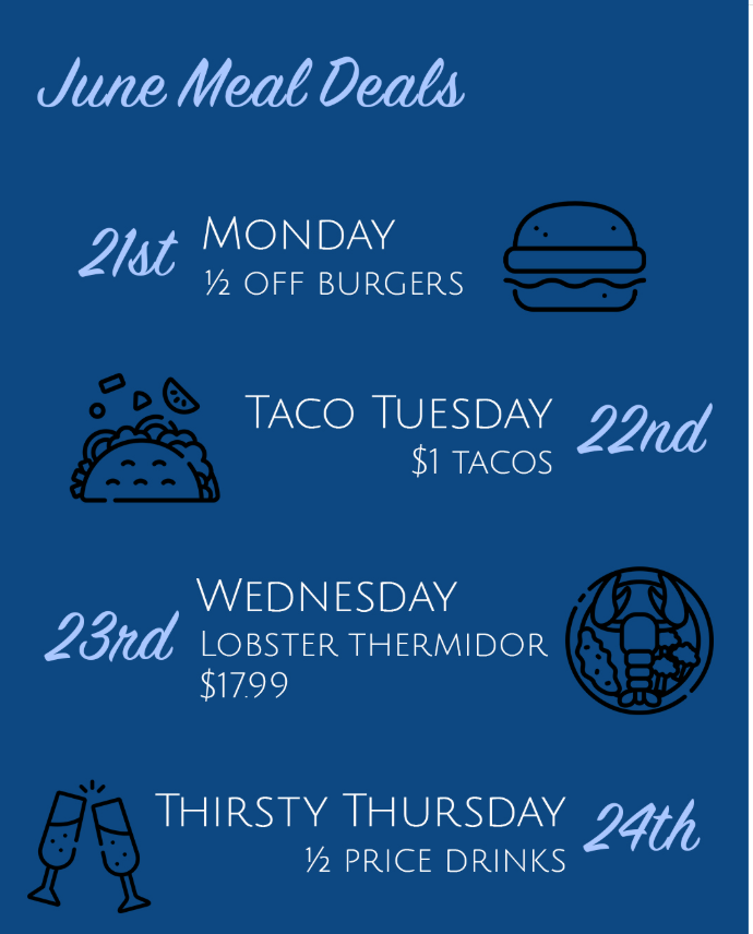
Choices made:
- Organized by dates
- Viewer can easily see if they’re free on a night and enjoy the deal.
- Made days of the week and deals vivid but readable
- Grouped information by dates and deals
- Excluded price of the hamburgers
- With the dollar sign, the copy becomes messy and overloading.
- Matches with ½ off drinks at the bottom, bringing closure to the graphic.
- Simple but consistent visual graphics of the food
- Creates a lighter atmosphere and brings the eye to rest.
- Royal blues help the graphic feel refined
- Leaves the viewer feeling like they’re getting high-quality food for a steal.
Wow, that was a lot.
But what did you learn?
Critically engaging with the material that I mindlessly scroll by is definitely a start. Obviously, I understood that there’s whole teams behind what I scroll through, but being able to dissect the choices they made and understanding its impact on me helps me to be a more mindful viewer and consumer.
Past that, having that knowledge aids me in creating graphics as I’m not just throwing ideas at the wall. I’m utilizing what I know the industry uses to
separate ideas to divide and group my own content in designs.
After I’ve uploaded Graphic-Final-v6-THEREALFINAL-2.pdf,
I can rationalize and defend all of the decisions I made
organizing the copy and ensure a client understands what the viewer will see.
Post a comment