Implementing Hierarchy in Dynamic Symmetrical and Asymmetrical Designs
Learning Objectives:
- Implement dynamic center-line in a design
- Implement asymmetry in a design
- Create hierarchy in a visually interesting, aesthetically pleasing design
- Use and organize basic typesetting for readability and balance
After reviewing and creating social media graphics with an emphasis on hierarchy, I created two book cover designs for Where the Sidewalk Ends by Shel Silverstein and considered hierarchy, movement, and balance throughout the designs while exploring color, contrast, and typography.
A couple of basic rules and restrictions given to me were:
- You must use different objects cut out of images on each design
- You must include the book title, author, and the phrase "New York Times Bestseller" or a subtitle
- You must use texture on each design
- Use a background that is not a single solid color. It must be textured.
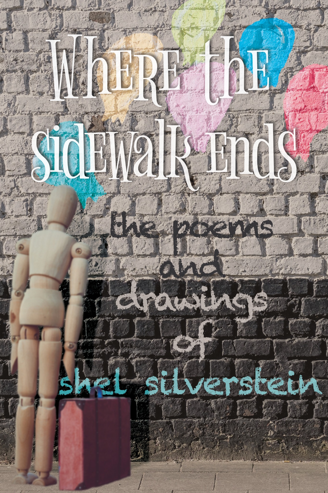
Symmetric Design
I started out with my symmetric design, pulling a photo of a black and white brick wall as my background and a sidewalk, thematically appropriate. After doing so, I looked around for fonts that fit the vibe of Shel Silverstein and his books, and selected two different fonts. I created my title and played around with different values, drop shadow, and inner glow until I was able to make it readable. Part of the issue was the thin strokes didn’t really hold your eye, but the drop shadow and it being laid over the balloons really helped.
I cut out balloons from an existing photo and made them appear as if they were drawn onto the wall with chalk as a secondary focal point, and a bit of a resting point. For my main focal point, I wanted something a little bizarre. I found this wooden man and cut him out, and applied some blur to him and a drop shadow to create distance. The red suitcase pulls the viewer in and then as the viewer runs up his body, they find the shadow before being pulled back down. After doing so, I made the subtitle and chose colors from the existing design, with a blue being applied to the author’s name for playfulness.
All said and done, I shifted the design around and sought out feedback from both peers and mentors until I came to this.
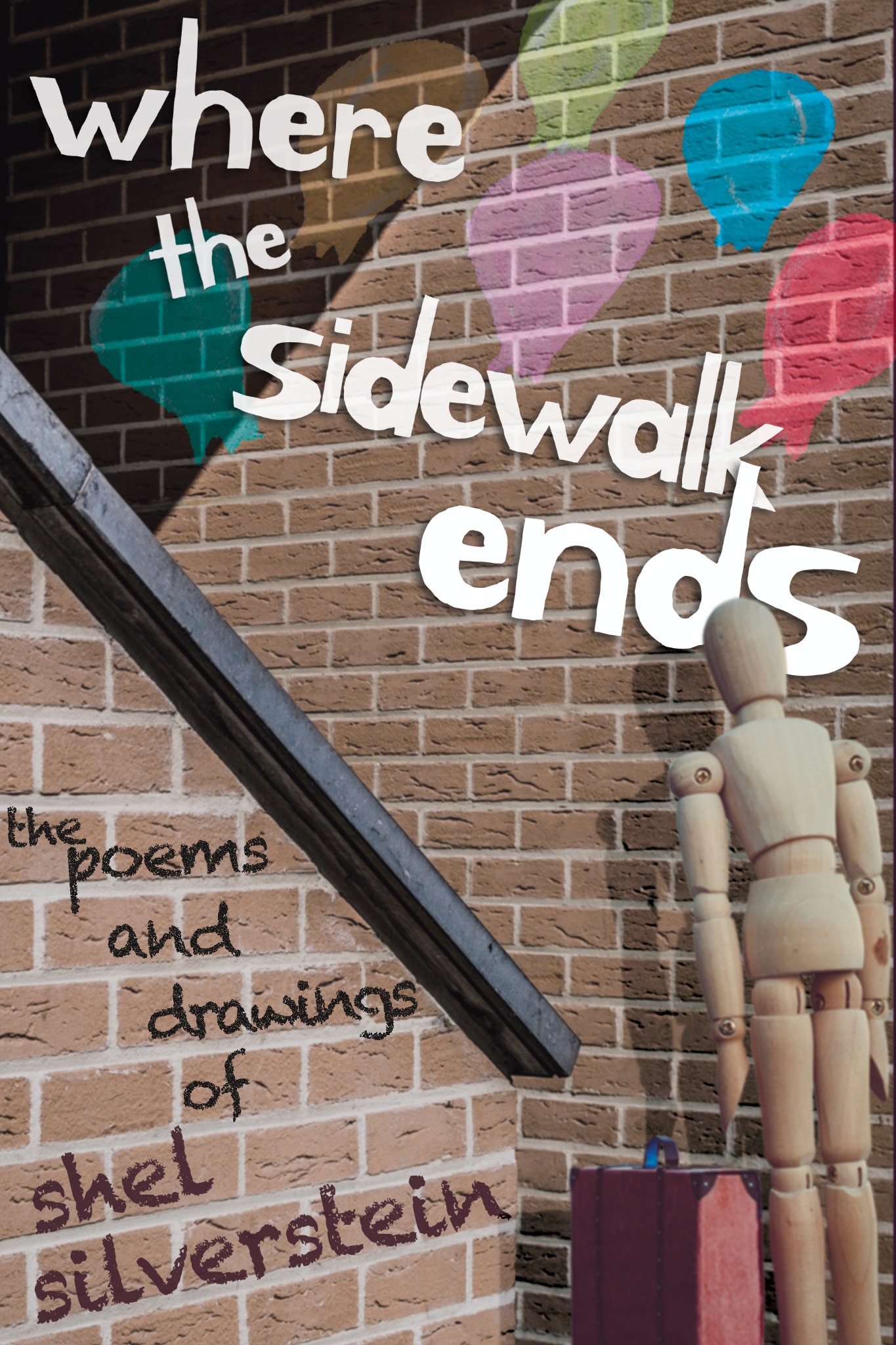
Asymmetric Design
For my asymmetrical design, I really liked the balloons and wooden man, as well as the chalky font, so I pulled those to reuse. I had to play around a lot more with the values and colors here as I didn’t have the luxury of such a stark background.
I chose the background as it’s a good starting point of movement and still evokes the feeling of going on a walk. I chose a more playful font for the title, and dodged some filler words like where and the, and really emphasized ends, even going so far as to overlay it on top of sidewalk.
One of the challenges of this design was to keep the viewer in the design without making it symmetrical, and I fixed that challenge by moving the balloons up to the right and emphasizing their color. After that, I bugged my peers for feedback and rearranged until I was satisfied.
Reflection
Overall, I’m happy with the designs in its hierarchical and symmetrical/asymmetrical sense. I learned a lot about the process of designing and creating a design that’s visually interesting and readable. From my symmetrical design, I learned to create a non-boring center-line design and punch and dodge words in an appropriate way. In my asymmetrical design, I learned how to move a viewer's eye through a design in a dynamic and interesting way
Post a comment